Dear every human on earth that’s ever typed text,
For 15 years, our beloved Calibri was Microsoft’s default font and crown keeper of office communications, but as you know, our relationship has come to a natural end. We changed. The technology we use every day has changed. And so, our search of the perfect font for higher resolution screens began. The font needed to have sharpness, uniformity, and be great for display type. It was exciting at times, but also intimidating. How do you replace Calibri? How do you find that one true font that can take its place as the rightful default?
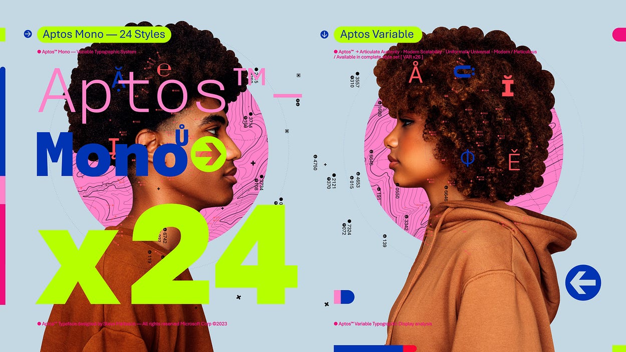
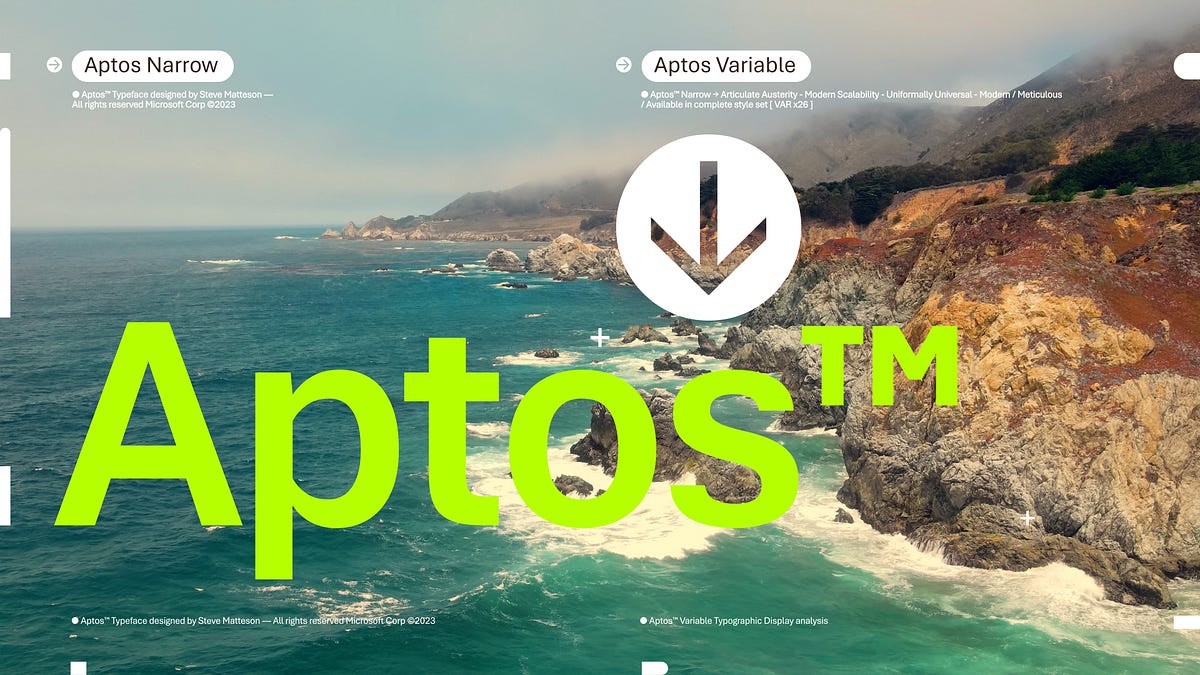
As we shared before, Microsoft commissioned five new fonts: Bierstadt, Grandview, Seaford, Skeena, and Tenorite. It was our hope that one of them would be our next default font for Microsoft 365. All of them were added to the drop-down font picker. From there, as you got a chance to use them, we listened to your impassioned feedback and chose the one that resonated most which was Bierstadt. But as there was a change of guard so too the name. Bierstadt is now known as Aptos.
Today we begin the final phase of this major change where Aptos will start appearing as the new default font across Word, Outlook, PowerPoint and Excel for hundreds of millions of users. And, over the next few months it will roll out to be the default for all our customers. We can’t wait for Aptos to be readily available since it was crafted to embody the many aspects of the human experience.
The typeface was created by Steve Matteson, one of the world’s leading type designers. His previous work includes the development of the original Windows TrueType core fonts and the creation of Segoe. Steve renamed the typeface he designed from Bierstadt to Aptos after his favorite unincorporated town in Santa Cruz, California, whose widely ranging landscape and climate epitomizes the font’s versatility. The fog, beaches, redwood trees, and mountains of Aptos summed up everything that he loved about California. Getting away from digital and evoking the outdoors was akin to getting back to pencil and paper. Drawing letters by hand would play a pivotal role in Steve’s creative process.
He designed the font with a slight humanist touch. He wanted Aptos to have the universal appeal of the late NPR newscaster Carl Kasell and the astute tone of The Late Show host Stephen Colbert. “There’s always that little voice inside of me saying, ‘You know, you gotta try to sneak in a little bit of humanity. You can’t just use rulers and straight edges and French curves (a template used to help draw uniformed curves) to make all these shapes mechanical.’ I did that by adding a little swing to the R and the double stacked g,” he said. Steve wanted the font to be more universal and less mechanical or institutional. Aptos had to induce trust and be engaging to read.
Read more:
A change of typeface: Microsoft’s new default font has arrived
Introducing Aptos, our modern successor to Calibri
Last edited:


