I have a PC with a 27" monitor and out of box 11 definitely rendered way worse for me than 10 did. Font rendering is better using dark mode, but since I prefer light, it took a lot of trial and error until I got everything acceptable for me and my eyes. In my case the issue was only in explorer. Here are the things I did. Maybe one or several of them will help you.
1. turn on clear type
2. set smooth edges of screen fonts'
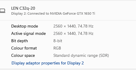
3. tweak scale and font size. settings-system-display. Make sure display rate is 60 hz. If scale looks decent in explorer you can then adjust your browsers zoom to suit you.
4.
Change Default System Font in Windows 11 Tutorial I tried many but in the end segoe ui actually rendered best for me
5. "Adjust Appearance and performance of Windows" set it to 'Adjust for best appearance'.
Universal apps and desktop apps will display differently as a hard-coded program's font size takes priority over the system font size.
I also found that changing the Windows default folder color from the pale yellow (that I couldn't see) to blue made a difference. Here's my old post about it, and
@FreeBooter solution.
Need help changing folder icons in explorer and regedit
Themes also affect fonts so find a theme you like and stick to it as well.