Hello Everyone & Happy New Yeay to all of you !
I'm finally back around here after hard and busy times.
I maybe found a way of helping out a bit at my level, thanks to
@davidvkimball 's explanations.
Thanks to all you great creators here, using Windows in its 11 edition design is much more pleasant.
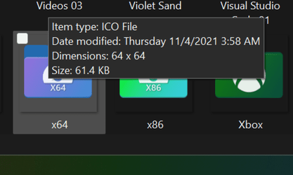
Since I've been using these really nice custom icons for a while, even if they are ment to be used (and really enjoyable) with a big size display, I realized they unfortunately appear a bit blurred in smaller sizes (ans sometimes smaller) compared to the original Microsoft folder icons. When a folder has a lot of sub-folders, using small/list/detail display remains commun and practical.
I clearly understood why when I zoomed and compared Microsoft's with custom ones.
Microsoft actually uses different pixels construction for each size, to rightly avoid blur and insure sharp clear edges.
When a image is basically resized, even in smaller dimensions, a bit of blurring is completely normal (it can sometimes be arranged with a "refining edge" trick, but results are not always great, and this will not use the same pixels Microsoft properly uses). It remains obviously useful for all the other aspects (rounded edges, gradient colors, logo shapes) where the conversion really tricks pixels cleverly to keep a nice and correct form.
This editing only concern the edges of the folder, in order to make lines look clear and sharp in all sizes, when displayed next to original/generic Microsoft ones. Here's a little example of how I rework the folder icons to give them the exact same shape as originals.
>
IcoFX rework (zoom in or/and press F11 for a correct rending)
You can spot the true difference in the small boxes of the left window.
I expect not all users need their icons reworked as they are usually displayed in 96x96 in explorer (Big icons).
But most of them will be shared and also used a lot in a smaller view.
All the work from creators here is really awesome, and I would be happy to contribute with helping by giving this tip top final aspect it deserve.
I does take a bit of time, so I don't think I'll manage as much as the collection is growing, but surely I could start with the most commonly used.
Note : I had a try with the 128x128 and 96x96, and it is really unnecessary. Automatic conversion in explorer is completely equivalent.
Though, the smallest 16x16 folder must fit all pixels large (no transparent gap).


.png")