- Local time
- 7:26 AM
- Posts
- 1,171
- OS
- Win 11 Enterprise
My Computer
System One
-
- OS
- Win 11 Enterprise
- Computer type
- Laptop
- CPU
- i7
- Hard Drives
- SSD
Follow along with the video below to see how to install our site as a web app on your home screen.
Note: This feature may not be available in some browsers.
Wow these are both super good! I think I like @atinfo's the most since it matches the Windows 11 style a bit more. But I love the options in @Lucas North's versions. The one I posted above is attempting to be as consistent as possible with Steam's gradient.
Thanks. Yes! Difficult part is the "Gradient"... (mine is not match Steam original circular icon, it is most Windows-ish! rather than Steam-ish!)I think I like @atinfo's the most since it matches the Windows 11 style a bit more. But I love the options in @Lucas North's versions. The one I posted above is attempting to be as consistent as possible with Steam's gradient.
Glad to hear!Great. Thank you!
Wow, this is magnificent. Great work. One small critique, at the 16px size, the top looks flat? Can you try scaling it down again and maintain a rounded side? Might not be worth redoing. I'm a huge fan of this .ICO file.
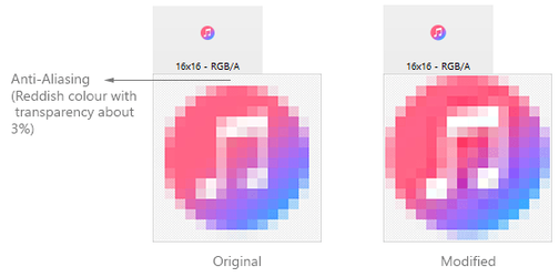
Many thanks. I didn't resize or scale the original PNG (from Ps into Axialis). The flat part which you see is Axialis anti-aliasing problem! (in small size, like 16px, it changes round edge colours to big amount of transparency). I had try to draw that space with custom transparent red but it didn't work good enough, I just resized the original PNG to fill 16px border (and I removed white space or the space for breathing!) and I think it looks better. Am I wrong (or it looks better)?One small critique, at the 16px size, the top looks flat? Can you try scaling it down again and maintain a rounded side?

New one looks better to me! Thanks for going to the trouble to improve it. :)Many thanks. I didn't resize or scale the original PNG (from Ps into Axialis). The flat part which you see is Axialis anti-aliasing problem! (in small size, like 16px, it changes round edge colours to big amount of transparency). I had try to draw that space with custom transparent red but it didn't work good enough, I just resized the original PNG to fill 16px border (and I removed white space or the space for breathing!) and I think it looks better. Am I wrong (or it looks better)?
View attachment 4651
If anyone is looking for new folder icons let me know, I'm in the mood to make some more.
Programs folder in a separate physical drive. In there, I have both stable versions and some βeta versions as well.βeta inscribed on it, with a light orange color, to easily distinguish the βeta apps for me?
ɑlpha on it. And a purple Dev folder.Yes, if I have time I will brainstorm an effective Beta / Alpha / Dev template. It will require more of a setup than the others, so please give me time. :)Hmmm.
I could throw about 120 different ones at you, but.....
Here is an easy one.
I run lots of programs in portable mode, from aProgramsfolder in a separate physical drive. In there, I have both stable versions and some βeta versions as well.
Any chance you could make a folder with the wordβetainscribed on it, with a light orange color, to easily distinguish the βeta apps for me?
I figure that would be easier than doing folder icons for all of these:
View attachment 5035
Maybe even an ɑlpha folder, red, withɑlphaon it. And a purpleDevfolder.
Heck, even the colors are not absolute, you're the designer here, just as long as they are different from each other and the regular folder color, that would be great!
I agree! I like the lighter version also. These look great. If you wanted to provide me with the transparent PNG assets, I could try my hand at making some smaller versions if you wanted.I did create a 'Macrium' icon using Axialis but anything below 24x24 just wasn't legible.
I even tried using an Orb for anything smaller but I wasn't happy with any of the results.
I may need to make further adjustments to the folder icon as well.
View attachment 5017View attachment 5023
I think I'll settle for version 2 on the right, I much prefer the lighter colors and the arrows are more visible.
Will these same Icons appear in The System Tray?Sure, here you go. Was challenging to do this gradient and keep it looking consistent, but I think it came out pretty well. :)
View attachment 4515
View attachment 4514
Top man! Cheers
